
Search…
Search…
3. Aufbau und Funktion eines PV-Systems
Solarmodule, Wechselrichter, Speicher, Monitoring Systemtypen: AC-/DC-Systeme, mit oder ohne Speicher Überblick: Plug & Play vs. große Dachanlagen
3. Aufbau und Funktion eines PV-Systems
Solarmodule, Wechselrichter, Speicher, Monitoring Systemtypen: AC-/DC-Systeme, mit oder ohne Speicher Überblick: Plug & Play vs. große Dachanlagen
3. Aufbau und Funktion eines PV-Systems
Solarmodule, Wechselrichter, Speicher, Monitoring Systemtypen: AC-/DC-Systeme, mit oder ohne Speicher Überblick: Plug & Play vs. große Dachanlagen
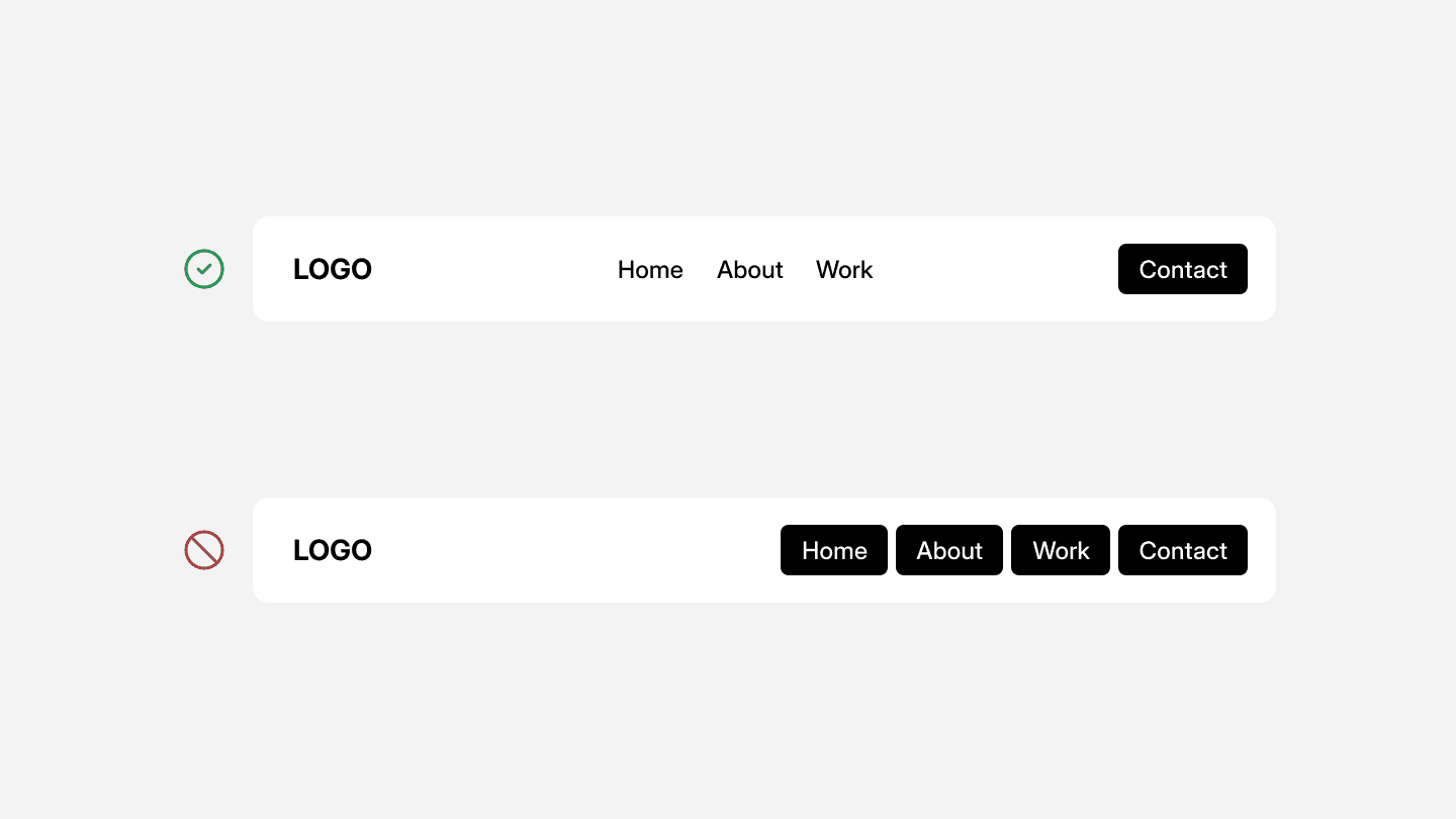
A well-designed button system ensures clarity, consistency, and accessibility, making interactions intuitive while reinforcing the visual identity of a product.
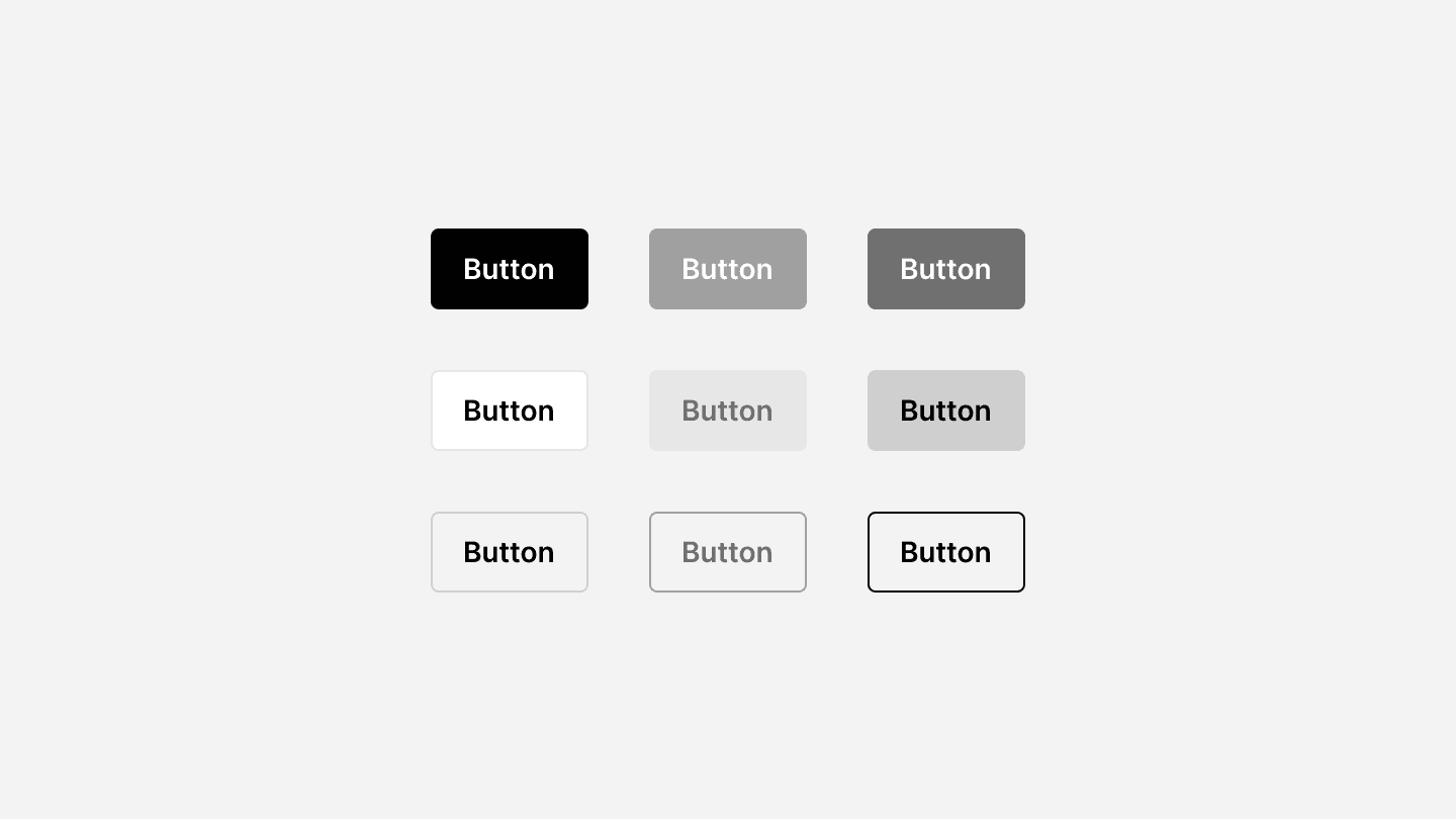
When to use
✅ Primary actions
✅ Secondary actions
✅ Tertiary actions
✅ Destructive actions
When not to use
⛔️ For navigation
⛔️ When there’s no clear action
⛔️ Too many buttons at once
A well-designed button system ensures clarity, consistency, and accessibility, making interactions intuitive while reinforcing the visual identity of a product.
When to use
✅ Primary actions
✅ Secondary actions
✅ Tertiary actions
✅ Destructive actions
When not to use
⛔️ For navigation
⛔️ When there’s no clear action
⛔️ Too many buttons at once
Continue reading
Du willst mitgestalten?
Dein Feedback zählt, wir versuchen unsere Lernplatform ständig zu verbessern, deshalb hören wir gerne deine Meinung. Egal ob es eine Idee für neuen Lerninhalt oder ein Fehler im System ist.
Du willst mitgestalten?
Dein Feedback zählt, wir versuchen unsere Lernplatform ständig zu verbessern, deshalb hören wir gerne deine Meinung. Egal ob es eine Idee für neuen Lerninhalt oder ein Fehler im System ist.
Du willst mitgestalten?
Dein Feedback zählt, wir versuchen unsere Lernplatform ständig zu verbessern, deshalb hören wir gerne deine Meinung. Egal ob es eine Idee für neuen Lerninhalt oder ein Fehler im System ist.