
Search…
Search…
1. Was ist Photovoltaik?
Unterschied zwischen Photovoltaik (PV) und Solarthermie Einsatzgebiete: Inselanlagen, Netzverbund, Mobilität Bedeutung für die Energiewende in der Schweiz
1. Was ist Photovoltaik?
Unterschied zwischen Photovoltaik (PV) und Solarthermie Einsatzgebiete: Inselanlagen, Netzverbund, Mobilität Bedeutung für die Energiewende in der Schweiz
1. Was ist Photovoltaik?
Unterschied zwischen Photovoltaik (PV) und Solarthermie Einsatzgebiete: Inselanlagen, Netzverbund, Mobilität Bedeutung für die Energiewende in der Schweiz
Work in progress
This page is still a work in progress, and some content may be updated or modified as we refine the details.
Work in progress
This page is still a work in progress, and some content may be updated or modified as we refine the details.
Work in progress
This page is still a work in progress, and some content may be updated or modified as we refine the details.

By using accordions, you provide a more interactive way for users to explore content at their own pace, reducing cognitive load and improving overall usability. When designed properly, accordions enhance the browsing experience without hiding essential information.
Accordions are useful for structuring content efficiently while keeping interfaces minimal. They should be used when users don’t need to see all content at once but require easy access to specific sections.
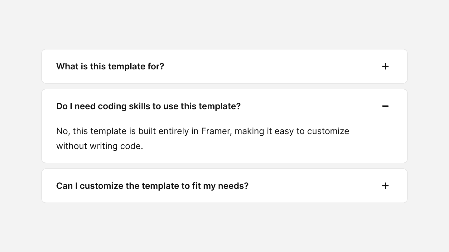
When to use
✅ FAQs and Help Sections
✅ Content-heavy pages
✅ Settings and configurations
✅ Mobile layouts
When not to use
⛔️ For essential content
⛔️ Too many nested sections
Best practices
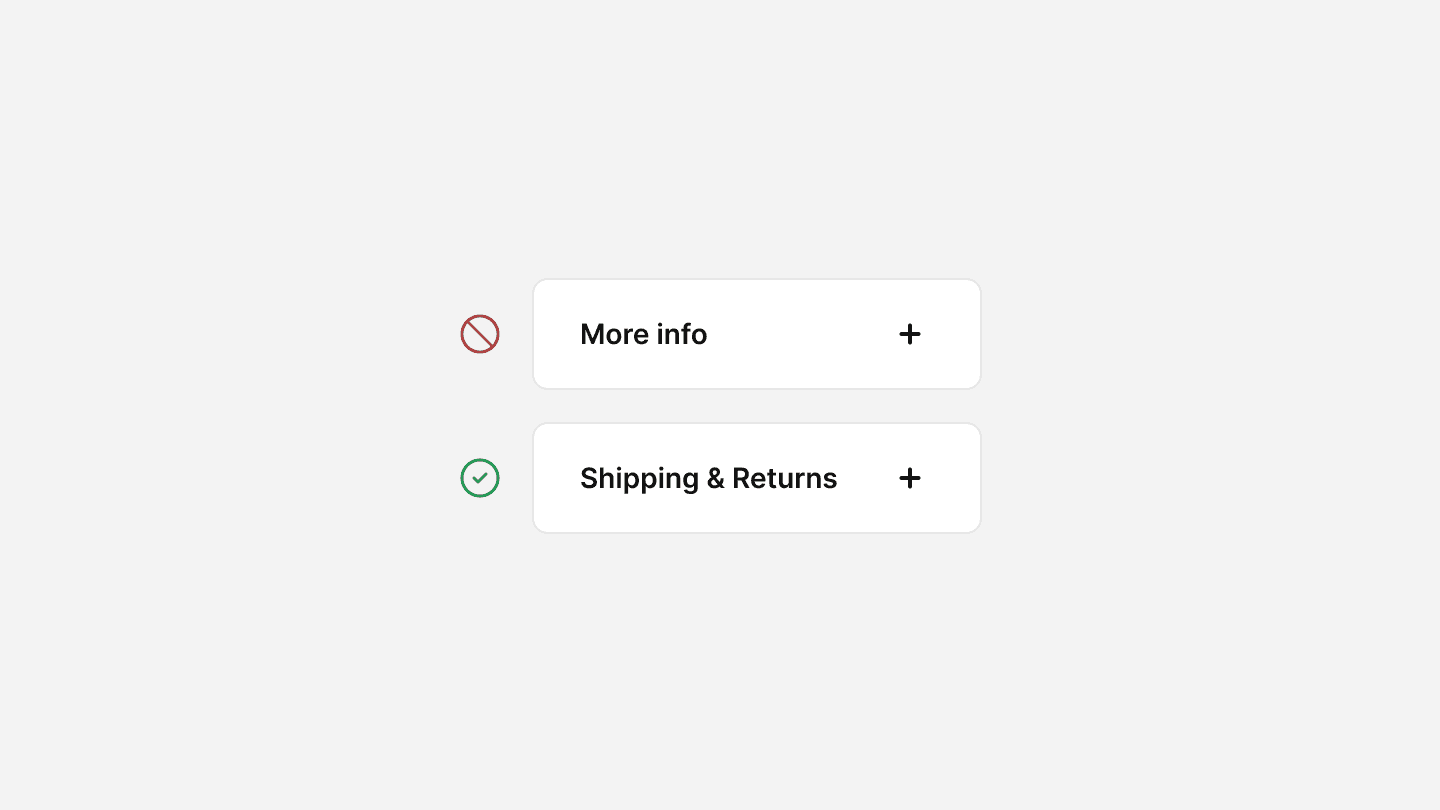
Use clear and concise labels
Accordion headers should be descriptive and self-explanatory, so users immediately understand what each section contains. Avoid vague titles like “More Info”—instead, use “Shipping & Returns” or “Technical Specifications”.
Provide visual indicators
Use icons like chevrons or plus/minus symbols to indicate expandable sections. This helps users quickly recognize interactive elements.
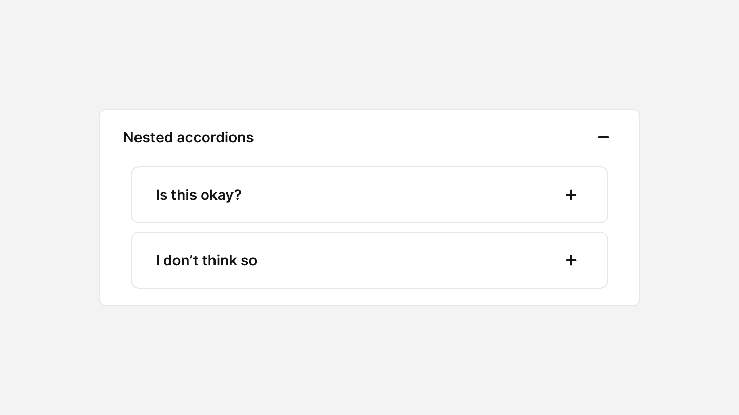
Limit nesting
Avoid placing accordions inside other accordions, as this can lead to a confusing and overwhelming user experience. If more structure is needed, consider alternative UI patterns like tabs.
By using accordions, you provide a more interactive way for users to explore content at their own pace, reducing cognitive load and improving overall usability. When designed properly, accordions enhance the browsing experience without hiding essential information.
Accordions are useful for structuring content efficiently while keeping interfaces minimal. They should be used when users don’t need to see all content at once but require easy access to specific sections.
When to use
✅ FAQs and Help Sections
✅ Content-heavy pages
✅ Settings and configurations
✅ Mobile layouts
When not to use
⛔️ For essential content
⛔️ Too many nested sections
Best practices
Use clear and concise labels
Accordion headers should be descriptive and self-explanatory, so users immediately understand what each section contains. Avoid vague titles like “More Info”—instead, use “Shipping & Returns” or “Technical Specifications”.
Provide visual indicators
Use icons like chevrons or plus/minus symbols to indicate expandable sections. This helps users quickly recognize interactive elements.
Limit nesting
Avoid placing accordions inside other accordions, as this can lead to a confusing and overwhelming user experience. If more structure is needed, consider alternative UI patterns like tabs.
Continue reading
Du willst mitgestalten?
Dein Feedback zählt, wir versuchen unsere Lernplatform ständig zu verbessern, deshalb hören wir gerne deine Meinung. Egal ob es eine Idee für neuen Lerninhalt oder ein Fehler im System ist.
Du willst mitgestalten?
Dein Feedback zählt, wir versuchen unsere Lernplatform ständig zu verbessern, deshalb hören wir gerne deine Meinung. Egal ob es eine Idee für neuen Lerninhalt oder ein Fehler im System ist.
Du willst mitgestalten?
Dein Feedback zählt, wir versuchen unsere Lernplatform ständig zu verbessern, deshalb hören wir gerne deine Meinung. Egal ob es eine Idee für neuen Lerninhalt oder ein Fehler im System ist.